This interview with Ron Williams and Woodson Rainey took place in May 2013 in New York City.
Hippie Modernism: The Struggle For Utopia. Edited by Andrew Blauvelt. Minneapolis : Walker Art Center, 2015.
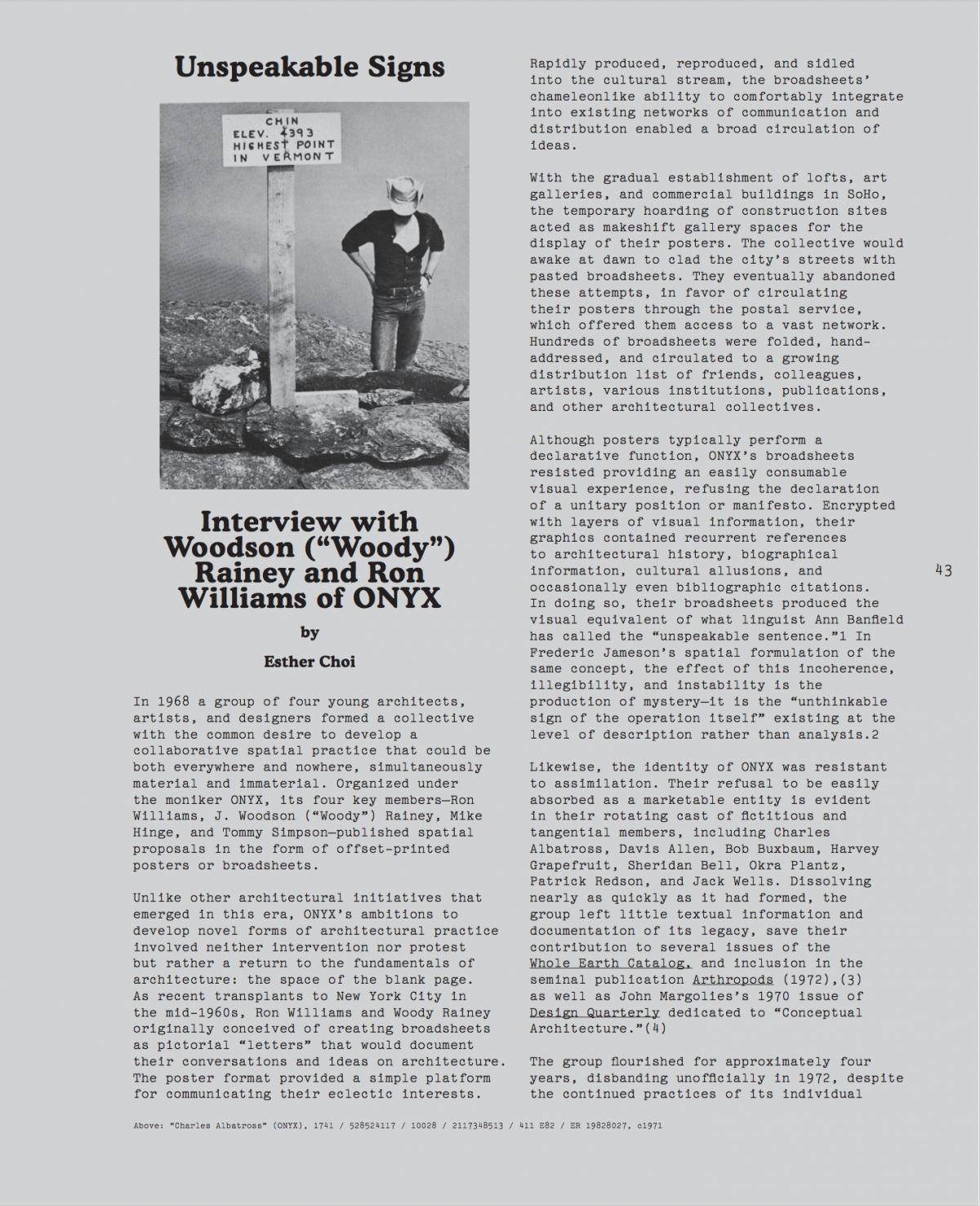


In 1968, a group of four young architects, artists and designers formed a collective with the common desire to develop a collaborative spatial practice that could be both everywhere and nowhere, simultaneously material and immaterial. Organized under the moniker ONYX, its four key members—Ron Williams, J. Woodson (“Woody”) Rainey, Mike Hinge, and Tommy Simpson—published spatial proposals in the form of offset-printed posters or broadsheets.
Unlike other architectural initiatives that emerged in this era, ONYX’s ambitions to develop novel forms of architectural practice involved neither intervention nor protest, but rather, a return to the fundamentals of architecture: the space of the blank page. As recent transplants to New York City in the mid-1960s, Ron Williams and Woody Rainey originally conceived of creating posters as pictorial “letters” that would document their conversations and ideas on architecture. The poster format provided a simple platform for communicating their eclectic interests. Rapidly produced, reproduced, and sidled into the cultural stream, the broadsheets’ chameleon-like ability to comfortably integrate into existing networks of communication and distribution enabled a broad circulation of ideas.
With the gradual establishment of lofts, art galleries, and commercial buildings in SoHo, the temporary hoarding of construction sites acted as makeshift gallery spaces for the display of their posters. The collective would awake at dawn to clad the city’s streets with pasted broadsheets. They eventually abandoned these attempts, in favor of circulating their broadsheets through the postal service, which offered them access to a vast network. Hundreds of broadsheets were folded, hand addressed, and circulated to a growing distribution list of friends, colleagues, artists, various institutions, publications, and other architectural collectives.
Although posters typically perform a declarative function, ONYX’s broadsheets demonstrated resistance to providing an easily consumable visual experience, refusing the declaration of a unitary position or manifesto. Encrypted with layers of visual information, their graphics contained recurrent references to architectural history, biographical information, cultural allusions, and occasionally even bibliographic citations. In doing so, their broadsheets produced the visual equivalent of what linguist Ann Banfield has referred to as the “unspeakable sentence.”1 In Frederic Jameson’s spatial formulation of the same concept, the effect of this incoherence, illegibility and instability is the production of mystery— it is the “unthinkable sign of the operation itself” existing at the level of description rather than analysis.2
Likewise, the identity of ONYX was resistant to assimilation. Their refusal to be easily absorbed as a marketable entity is evident in their rotating cast of fictitious and tangential members, including Charles Albatross, Davis Allen, Bob Buxbaum, Harvey Grapefruit, Sheridan Bell, Okra Plantz, Patrick Redson, and Jack Wells. Dissolving nearly as quickly as it had formed, the group left little textual information and documentation of its legacy, save their contribution to several issues of the group left little textual information and documentation of its legacy, save their contribution to several issues of the Whole Earth Catalog, and inclusion in the seminal publication Arthropods (1972),3 as well as John Margolies’s 1970 issue of Design Quarterly dedicated to “Conceptual Architecture.”4
The group flourished for approximately four years, disbanding unofficially in 1972, despite the continued practices of its individual members who produced ONYX-related design material until the mid-1970s.
This interview took place in May 2013 in New York.
Esther Choi: In the early 1970s, Jim Burns featured ONYX in his seminal book Arthropods alongside an international array of architectural collectives. While reading your account of ONYX’s formation on your website, I was struck by how different your model of collectivity is compared to the other groups in Burns’s book. Rather than revolving around a narrow set of objectives, maintaining diverse perspectives within the collective was valued and central to your output.
Woodson (Woody) Rainey: Ron and I both attended the University of Utah in the fifties and sixties. The architecture school was exceptional in its strong emphasis on drawing and graphic skills. The University’s art school was across the street and there was significant overlap with students and faculty. When I moved to New York, I lived near Ron and his wife. We spent a lot of time together, locked in a conversation of ideas. We both were drawing constantly.
We thought that other people might be interested in these conversations and we talked about writing a communal letter. That notion grew into a collage of drawings and ideas. As it developed, it was clear that something brand new was being built. We thought that it would be interesting to see the responses if we printed it and sent it anonymously to a mailing list wider that our close acquaintances.
We produced several hundred copies of the first broadsheet, hand addressed and mailed them to a few hundred people we knew and people we didn’t know. We had a tremendous response—mostly questions like: “Who are you? Who do you do this for? Why are you doing this?” and, “Can I have one? Can you send one to my friend?” Sometimes people would share things with us. Ed Ruscha sent us a book. We encountered Ant Farm. A network began to develop.
We came up with the name ONYX. It was a wonderfully graphic word: O-N-Y-X. It could be an acronym for something else. It looked great in print. It referred to the multilayered stone; there were lots of aspects to the name. At least until the presentation of our first piece, ONYX was not a collective. It was Ron and I drawing and making the broadsheets.
Ron Williams: I'm hesitant to even refer to ONYX as a collective because I see collectives as having singular aims and a collective consciousness pursuing those aims. A more accurate description of ONYX would be that it existed as anti-collective or non-collective. We were in favor of a diversity of ideas rather than a singular idea.
EC: Can you explain how you collaborated on these pieces?
RW: We didn’t really collaborate conceptually. I tried illustrating one of Woody’s ideas; that’s about it. If I had an idea, he might illustrate it.
WR: We didn’t sit on opposite sides of the table sketching, but we didn’t work in isolation.
RW: I can’t remember a time when one of us told the other that their work looked bad. We never criticized or had anything negative to say about each other’s work. Mike did work, for example, for science fiction and fantasy magazines. I learned from it, marveled at it and how well it was done.
EC: I have been thinking about how your very stylized moniker ONYX served—and I use this word somewhat tentatively—like a branding device for the collective. Although the content of your posters and your own personal interests differed substantially, the logo ONYX remained consistent.
In branding, logos can be applied to just about anything and with a brand or a corporation, both producers and consumers have an individual relationship to and an affiliation with a larger, symbolic whole. I noticed that many of your posters had both a logo and an attribution to the individual author. It’s not with total anonymity that ONYX existed as an entity. Could you talk about your decision to do this?
RW: The logo really wasn't consistent. The idea of a logo as they were used then didn’t apply. We spelled the word with images of trees, with circuit board graphics, different typefaces. The idea was to move beyond a word that meant just one thing, like the logo for a bank. We used the word as a symbol for a variety of ideas. I think “brand” is probably not a word that any of us would have chosen.
WR: We didn’t put our real names on the first broadsheet. The graphic of the yellow broadsheet for example, is attributed to Patrick Redson, a nom de plume. WE used other names: Harvey Grapefruit, Charles Albatross. ONYX gave us a form for thinking in a different way. With the ONYX vehicle, we had a forum and a publishing umbrella. Sometimes the ideas we discussed were goofy and sometimes serious and some that we're still interested in forty years later.
As a new New Yorker in 1968, I thought about the difference in the way I related to the daylight/darkness cycle. In Utah, you get up with the sun and go to bed with the sun. In New York, where one is further from nature, you get up when you want and go to bed when you want. I had the idea that a 28-hour day, six-day week was more realistic and more social. Because we had ONYX, I illustrated the idea in the Calendar broadsheet (1971).
RW: There were all kinds of things that could pop up and contribute to the conversation. We didn’t do a lot to avoid the scene here; we just didn’t get involved in the academic and limitedly popular conversation that was going on then.
Our work was graphic. I think there was a certain apprehension toward our "project" as it was certainly outside of any example of the work anyone else was doing. To support ourselves and keep ONYX going, we had jobs in architecture much like an artist or actor might have a job waiting tables or selling clothes.
EC: Could you say more about this apprehension toward ONYX’s work on the part of your audience, and in particular, on the part of the academy or the institution?
RW: It’s like when our work was labeled as “ONYX stuff.” That’s something I saw as a mild fear: like using the polite term, “I’m afraid I won’t be able to…”
ONYX was perceived as borderline [hippie] because we found a lot of interesting graphics in what hippies were doing. We looked at a lot of the music world's printed material, largely from the standpoint of seeing how people assembled it. And there was Tadanori Yokoo in Japan.
WR: There’s a cartoon of William Morris giving a lecture: he’s a large man with his back to the audience weaving on a loom; in a way, I think that’s what we were like. At that time, there were basically two networks growing: There was a theoretical network around the theorizing of The Institute for Architecture and Urban Studies (IAUS) in New York and Europe, and there was another, “counter-design" or "alternative design” such as the Arthropods groups. It stretched from Japan, Italy, Vienna, San Francisco and Texas to New York. We didn’t know about anybody other than Archigram when we started publishing, but almost immediately many of these groups corresponded with us. What we were doing was physical, graphic, rather than being theory oriented.
Louis Sullivan, the Fillmore posters, Archigram and Superstudio, whom we admired for their graphic works, were all of interest. I still draw the Sullivan ornaments to try to figure out what he was thinking when he made them. There isn’t a lot of theory in that, unless you consider geometry or craft to embody theory. It’s more logical to sit with your back to an audience and draw.
EC: How did you feel about being affiliated with the Whole Earth scene?
WR: I was very excited by the Whole Earth Catalog. That excitement had to do with the WEC’S practical gathering of information for use in alternative ways; we were into gathering information. There was also shared a kindred spirit about the earth.
RW: The Whole Earth Catalog was of and for the many — and we were of the many. We felt compelled to share ideas. It’s like the discussion groups that you see on the web. I think that a lot of what happened with the development of the computer and the refinement of the web arose out of the ideas, longings and visions that a lot of people had at that time.
WR: An interesting experiment might be to produce another broadsheet. I think we could send one out today and it would generate a similar response. It’s unusual to get anything in the mail today; anything of interest usually arrives on the Web. I look at the ONYX drawings, broadsheets and publications and I know they are authentic. We did something that’s retained its integrity.
EC: Some historians have explored how the Whole Earth Catalog offered an early, idealistic model of the web, which led eventually to the formation of the Internet. Some have also explored how mail art precipitated the relational networks of the Internet. What was your relationship to mail art?
RW: Ray Johnson and others involved in the Fluxus movement responded to the ONYX material we sent to them. It was gratifying to realize that though we didn't understand Fluxus, none of those involved in it understood it either. While that constituted one network, the Whole Earth Catalog actually became quite attractive. A lot of our contributions to the Whole Earth Catalog were made as ONYX.
EC: Clearly, the computer changed your practice as architects.
RW: Not really; we continued to draw. Business letters became easier to deal with and store. The KayPro and the first Mac computer came along. The one thing I wanted most when I was drawing these images was a computer that could ease their production. When the computer finally did replace that effort there was, amazingly, no need for it anymore. The dissolution of analog as a means of communication was very comfortable. Now we're back into the cyber world with websites, blogs and tweeting birds.
EC: Were you reading about systems theory or thinking about technology in a conscious way? Did that interest you at the time?
WR: I recall being very interested in Marshall McLuhan and his first book, The Mechanical Bride. I also became interested in the idea of a cybernetic forest, which was, I believe, a poem i read in the Whole Earth Catalog. But I've never been a cyber guy and that was probably because I loved to draw. You could always find someone else to do the computer stuff.
RW: We were into systems and what their development might mean in school and in a way we were already using the systematic approaches being discussed at the time. I was doing paintings that were organized with multiple arrangements of paths and ellipses that made analyzable arrangements of some depth. They were meant to visualize the implications of what happens when systems interact. There’s an irony there: it was also a time when you could always find someone to do a drawing.
EC: It’s interesting that although the ONYX project was predicated on communication, you’ve said that, in some ways, there was not much literally, to say, i.e., you weren’t interested in communicating your ideas linguistically.
WR: Graphics were our conversation vehicle.
RW: I hesitate to call what we sent out "posters." A poster is something that has a simple message. When these arrived in the mail folded, then opened and looked at for the first time I believe they seldom made it onto a wall. These broadsheets could only be called posters in the spirit of Jalal Toufic's call for a poster that begets what it announces; as posters, these sheets would be begetting the projects they announce and depict.
EC: I’d like to talk more about your graphic strategies then, and in particular, how your graphics operate in a flat and projective manner that’s different than a rendering. If you take, for example, Superstudio’s Continuous Monument, they’ve illustrated an entire scene using perspectival conventions. In your broadsheets, however, the effect is extremely destabilizing for the viewer, whether you’re reading the text or reading the image. It’s very compelling as an embodied visual experience, which is more accessible and immediately engaging than a more conventional architectural rendering. Since what you produced was really outside the graphic conventions of architecture, was the project born from an active desire to push against the visual constraints of architectural representation? Your experimental approach made spatial graphics at once more accessible and more complicated.
WR: We both made a living to some degree as architectural illustrators, and we helped to establish the axonometric as a reasonable projective technique. It was the first time that architects used illustrations that did anything that weren’t conventionally illustrative.
RW: We were quite accomplished as far as being architectural renderers. We had a clientele; there were people who just wanted us to produce their drawings. There was always the question: “Is there another way?” In the Eastern depiction of space there’s a particular way that the hierarchy of the drawing is assembled. Axonometric conventions show an object as it is, rather than how it appears. We had architectural ideas that were not often susceptible to the conventional techniques of rendering. The axonometric became more expressive of these ideas as opposed to "projects." We weren't pushing against anything. We'd just found a different way of expressing our ideas.
EC: The way you’ve assembled the varied references on your broadsheets akin to conventions used in traditional East Asian landscape painting, along with the graphic nature of your line work, has an effect of rendering meaning to all of these signifiers as equivalents. That is, we comprehend these individual pictorial elements associatively, rather than in a linear, narrative format, similar to how ornament functions visually.
RW: Yes. That’s a good description of what this style does. An interpretation of the axonometric illustration is that it is of an idea whereas the perspective picture is of what the idea would look like realized.
EC: The sources of ornament in your broadsheets relate both to architecture and popular culture. Along with Louis Sullivan, there’s a pronounced psychedelic element to your work. Both relate formally.
WR: When we referenced other media, we weren't relating to other cultural events. The psychedelic Fillmore posters were specifically about the music or the world of the hippie and a lot of Art Nouveau. Our work was about creatively exploiting the format, and then we invited others to use our format.
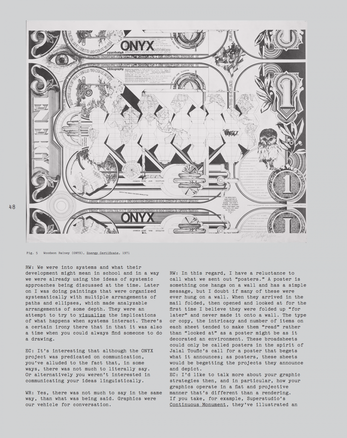
These forms allowed us to map personal affects. The Energy Certificate broadsheet was a personal narrative. I was about to move back to Utah. We were interested in Buckminster Fuller and the geometry of his maps. I used that reference to illustrate the route back to Utah: how I was going to get there – and to talk about my childhood. It was a statement that was only related to ONYX in form. It was an idea to use to explore the graphics.
EC: The British industrial designer and botanist Christopher Dresser, a major influence for Sullivan, wrote that, “Ornament, then, ever has expressed the sentiments of the age in which it has originated, and the ancient decorative forms still tell of the faith of our ancestors; but as our creed differs from theirs, and as we are not prepared to endorse all their sentiments, we cannot fitly appropriate to ourselves those ornaments with which we do not sympathize, as they are an expression of sentiments in which we cannot concur.”5 Dresser’s theory proposed that ornament offers a mode of representation that captures and conveys the appropriate affects of the time, associatively, non-linearly and non-linguistically. This echoes theories of typography and typeface design.
RW: I find Dresser's comments compelling but obscure. My attitude toward ornament is based on "relief for the eye." In a space that’s ornament free, there’s little to impel the eye to change focus. A modernist’s column meets a beam or ceiling minimally - there's no reason to look there. When at a column’s top there’s a capital, the focus we use to apprehend the larger space is changes. Our vision narrows and our depth of field changes. The whole space appears and feels differently, our sense of scale and dimension is altered.
The experience of the wealth of ornament on a Sullivan building takes the encounter to another level, beyond the boring rectangular framework of the office building into an image of nature in its richness and possibility, a playground for the eye.
EC: What I find particularly fascinating is how your architectural proposals—the Daily Earth Chronicle, the Six Foot House, the Head Start Monument and Woody's House-Turned-Inside-Out are nested in a field of ornament, compiled from both architectural and “vernacular” sources, enabling one to consider and contextualize your spatial propositions amidst a haze of atmospheres, attitudes and affects– typically not the material or conceptual “stuff” of architectural discourse or practice.
RW: At last, the subject matter. Yes, we did have something to talk about, graphically, of course. There are many drawings, paintings, models and much writing about these projects and others as well. A funny thing happened when we exhibited them: people saw them as art and wanted to buy and own them. We haven't exorcised these ideas from our consciousness; it's still a dream to build the Daily Earth Chronicle. But now instead of setting it up on the Nebraska prairie, it's to put up a full sized model in the New Museum in New York, projecting out over the Bowery in all its glory.
The "field of ornament" presents a question beyond what we mentioned earlier about architectural embellishments. I have to refer again to the eye and the pursuit of its delight. An abiding principle for some time in the fifties was Vitruvius's "Firmness, Commodity and Delight." Aside from the discussion of the principle that has sustained writers ever since, it was an influence on us but never overt.
The situation with the broadsheets might be simply attributed to a more primitive impulse, the fear of empty space. But isn't that what drives the urge to build? Our field of ornament might just be plain old symbol.
-
See Ann Banfield, Unspeakable Sentences: Narration and
Representation in the Language of Fiction (Boston: Routledge & Paul, 1982). - See Frederic Jameson's discussion of the room as a spatial typology in Von Vogt's science fiction, which produces "not a theory but a mystery." Frederic Jameson, Archaeologies of the Future: The Desire Called Utopia and Other Science Fictions (New York: Verso, 2005), 321.
- Jim Burns, Arthropods: New Design Futures (London: Academy Editions, 1972).
- John Margolies, Design Quarterly 78/79 (1970).
- See Christopher Dresser, The Art of Decorative Design (London: Day and son, 1862), 14.
Hippie Modernism: The Struggle for Utopia.
Walker Art Center (Oct. 24, 2015–Feb. 28, 2016)
BAMPFA (Feb. 8–May 21, 2017)
Curated by Andrew Blauvelt
This Walker-organized exhibition, assembled with the assistance of the Berkeley Art Museum/Pacific Film Archive, examines the intersections of art, architecture, and design with the counterculture of the 1960s and early 1970s. A time of great upheaval, this period witnessed a variety of radical experiments that challenged societal and professional expectations, overturned traditional hierarchies, explored new media and materials, and formed alternative communities and new ways of living and working together. During this key moment, many artists, architects, and designers individually and collectively began a search for a new kind of utopia, whether technological, ecological, or political, and with it offered a critique of the existing society.